android {
lintOptions {
// settotrueto turn off analysis progress reporting by lint
quiet true
// iftrue, stop the gradle build if errors arefound
abortOnError false
// iftrue, only report errors
ignoreWarnings true
// iftrue, emit full/absolute paths to files with errors (truebydefault)
absolutePaths true
// iftrue, checkall issues, including those that are off bydefault
checkAllWarnings true
// iftrue, treat all warnings as errors
warningsAsErrors true
// turn off checking the given issue ids
disable 'TypographyFractions','TypographyQuotes'
// turn on the given issue ids
enable 'RtlHardcoded','RtlCompat', 'RtlEnabled'
// check *only* the given issue ids
check'NewApi', 'InlinedApi'
// iftrue, dont include source code lines in the error output
noLines true
// iftrue, showall locations for an error, donottruncate lists, etc.
showAll true
// Fallback lint configuration (default severities, etc.)
lintConfig file("default-lint.xml")
// iftrue, generate a text report of issues (falsebydefault)
textReport true
// location towrite the output; can be a file or 'stdout'
textOutput 'stdout'
// if true, generate an XML report for use by for example Jenkins
xmlReport false
// file to write report to (if not specified, defaults to lint-results.xml)
xmlOutput file("lint-report.xml")
// if true, generate an HTML report (with issue explanations, sourcecode, etc)
htmlReport true
// optional path to report (default will be lint-results.html in the builddir)
htmlOutput file("lint-report.html")
// settotrueto have all release builds run lint on issues with severity=fatal
// and abort the build (controlled by abortOnError above) if fatal issues arefound
checkReleaseBuilds true
// Set the severity of the given issues to fatal (which means they will be
// checked during release builds (even if the lint target isnot included)
fatal 'NewApi', 'InlineApi'
// Set the severity of the given issues to error
error 'Wakelock', 'TextViewEdits'
// Set the severity of the given issues to warning
warning 'ResourceAsColor'
// Set the severity of the given issues to ignore (same as disabling the check)
ignore 'TypographyQuotes'
}
}
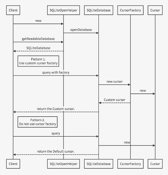
publicclassMyContentProviderextendsContentProvider {@OverridepublicbooleanonCreate() {
db = new MySQLiteOpenHelper(context, DB_NAME,
new MyCursorFactory(), DB_VERSION);
...
}
}
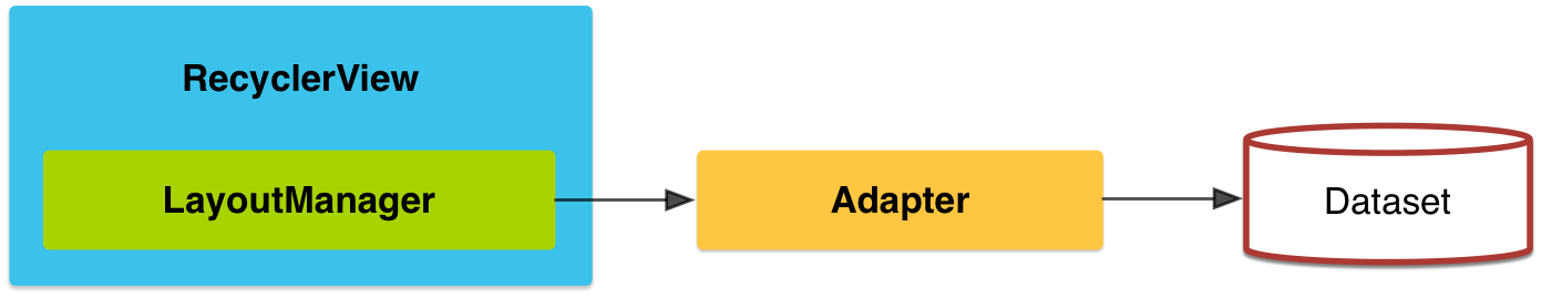
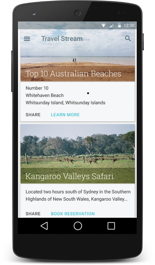
The RecyclerView widget is a more advanced and flexible version of ListView. This widget is a container for displaying large data sets that can be scrolled very efficiently by maintaining a limited number of views. Use the RecyclerView widget when you have data collections whose elements change at runtime based on user action or network events.
To use the RecyclerView widget, you have to specify an adapter and a layout manager. To create an adapter, extend the RecyclerView.Adapter class. The details of the implementation depend on the specifics of your dataset and the type of views. For more information, see the examples below.
A layout manager positions item views inside a RecyclerView and determines when to reuse item views that are no longer visible to the user. To reuse (or recycle) a view, a layout manager may ask the adapter to replace the contents of the view with a different element from the dataset. Recycling views in this manner improves performance by avoiding the creation of unnecessary views or performing expensive findViewById() lookups.
Animations for adding and removing items are enabled by default in RecyclerView. To customize these animations, extend the RecyclerView.ItemAnimator class and use the RecyclerView.setItemAnimator() method.
The following code example demonstrates how to add the RecyclerView to a layout:
以下のコードは, レイアウトにRecyclerViewを追加する方法の一例です.
<!-- A RecyclerView with some commonly used attributes --><android.support.v7.widget.RecyclerView
android:id="@+id/my_recycler_view"android:scrollbars="vertical"android:layout_width="match_parent"android:layout_height="match_parent"/>
Once you have added a RecyclerView widget to your layout, obtain a handle to the object, connect it to a layout manager, and attach an adapter for the data to be displayed:
publicclassMyActivityextendsActivity {private RecyclerView mRecyclerView;
private RecyclerView.Adapter mAdapter;
private RecyclerView.LayoutManager mLayoutManager;
@OverrideprotectedvoidonCreate(Bundle savedInstanceState) {
super.onCreate(savedInstanceState);
setContentView(R.layout.my_activity);
mRecyclerView = (RecyclerView) findViewById(R.id.my_recycler_view);
// use this setting to improve performance if you know that changes// in content do not change the layout size of the RecyclerView
mRecyclerView.setHasFixedSize(true);
// use a linear layout manager
mLayoutManager = new LinearLayoutManager(this);
mRecyclerView.setLayoutManager(mLayoutManager);
// specify an adapter (see also next example)
mAdapter = new MyAdapter(myDataset);
mRecyclerView.setAdapter(mAdapter);
}
...
}
The adapter provides access to the items in your data set, creates views for items, and replaces the content of some of the views with new data items when the original item is no longer visible. The following code example shows a simple implementation for a data set that consists of an array of strings displayed using TextView widgets:
publicclassMyAdapterextendsRecyclerView.Adapter<MyAdapter.ViewHolder> {private String[] mDataset;
// Provide a reference to the views for each data item// Complex data items may need more than one view per item, and// you provide access to all the views for a data item in a view holderpublicstaticclassViewHolderextendsRecyclerView.ViewHolder {// each data item is just a string in this casepublic TextView mTextView;
publicViewHolder(TextView v) {
super(v);
mTextView = v;
}
}
// Provide a suitable constructor (depends on the kind of dataset)publicMyAdapter(String[] myDataset) {
mDataset = myDataset;
}
// Create new views (invoked by the layout manager)@Overridepublic MyAdapter.ViewHolder onCreateViewHolder(ViewGroup parent,
int viewType) {
// create a new view
View v = LayoutInflater.from(parent.getContext())
.inflate(R.layout.my_text_view, parent, false);
// set the view's size, margins, paddings and layout parameters
...
ViewHolder vh = new ViewHolder(v);
return vh;
}
// Replace the contents of a view (invoked by the layout manager)@OverridepublicvoidonBindViewHolder(ViewHolder holder, int position) {
// - get element from your dataset at this position// - replace the contents of the view with that element
holder.mTextView.setText(mDataset[position]);
}
// Return the size of your dataset (invoked by the layout manager)@OverridepublicintgetItemCount() {
return mDataset.length;
}
}
Create Cards
Figure 3. Card examples.
CardView extends the FrameLayout class and lets you show information inside cards that have a consistent look across the platform. CardView widgets can have shadows and rounded corners.
To create a card with a shadow, use the card_view:cardElevation attribute. CardView uses real elevation and dynamic shadows on Android 5.0 (API level 21) and above and falls back to a programmatic shadow implementation on earlier versions. For more information, see Maintaining Compatibility.
The following code example shows you how to include a CardView widget in your layout:
以下のコード例は, レイアウトにCardView widgetを含む方法です.
<LinearLayoutxmlns:android="http://schemas.android.com/apk/res/android"xmlns:tools="http://schemas.android.com/tools"xmlns:card_view="http://schemas.android.com/apk/res-auto"... ><!-- A CardView that contains a TextView --><android.support.v7.widget.CardView
xmlns:card_view="http://schemas.android.com/apk/res-auto"android:id="@+id/card_view"android:layout_gravity="center"android:layout_width="200dp"android:layout_height="200dp"card_view:cardCornerRadius="4dp"><TextView
android:id="@+id/info_text"android:layout_width="match_parent"android:layout_height="match_parent" /></android.support.v7.widget.CardView></LinearLayout>
For more information, see the API reference for CardView.
The RecyclerView and CardView widgets are part of the v7 Support Libraries. To use these widgets in your project, add these Gradle dependencies to your app’s module:
LICENSE
Portions of this page are modifications based on work created and shared by the Android Open Source Project and used according to terms described in the Creative Commons 2.5 Attribution License.
Original source: http://developer.android.com/training/material/lists-cards.html
System widgets that let you set their color palette
Touch feedback animations for the system widgets
Activity transition animations
新しいmaterial themeは以下を提供します.
カラーパレットを設定できるシステムウィジェット
システムウィジェット用タッチフィードバックアニメーション
Activity transitionアニメーション
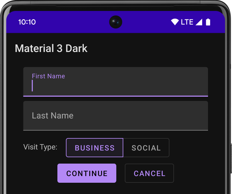
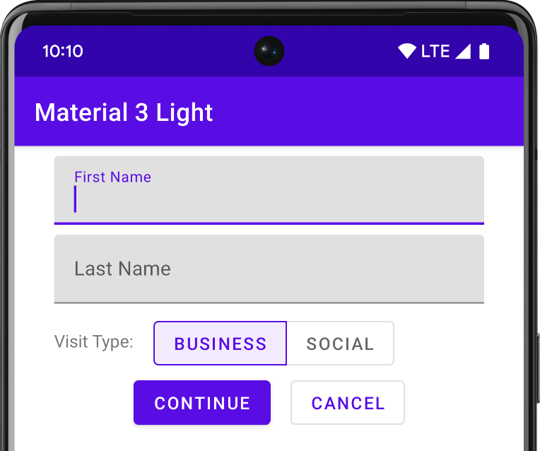
You can customize the look of the material theme according to your brand identity with a color palette you control. You can tint the action bar and the status bar using theme attributes, as shown in Figure 3.
The system widgets have a new design and touch feedback animations. You can customize the color palette, the touch feedback animations, and the activity transitions for your app.
Note: The material theme is only available in Android 5.0 (API level 21) and above. The v7 Support Libraries provide themes with material design styles for some widgets and support for customizing the color palette. For more information, see Maintaining Compatibility.
To customize the theme’s base colors to fit your brand, define your custom colors using theme attributes when you inherit from the material theme:
ブランドに合うthemeのベースカラーにカスタマイズするためには, material themeを継承しtheme属性を使用してカスタムカラーを定義します.
<resources><!-- inherit from the material theme --><stylename="AppTheme"parent="android:Theme.Material">
<!--Mainthemecolors-->
<!--yourappbrandingcolorfortheappbar-->
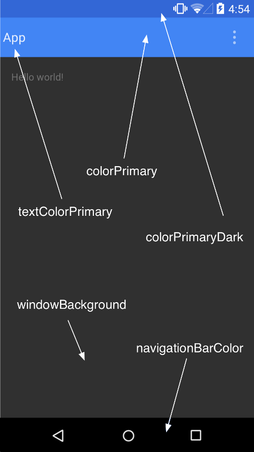
<itemname="android:colorPrimary">@color/primary</item>
<!-- darker variant for the status bar and contextual app bars -->
<item name="android:colorPrimaryDark">@color/primary_dark</item>
<!-- theme UI controls like checkboxes and text fields -->
<item name="android:colorAccent">@color/accent</item>
</style></resources>
Figure 3. Customizing the material theme.
Customize the Status Bar
The material theme lets you easily customize the status bar, so you can specify a color that fits your brand and provides enough contrast to show the white status icons. To set a custom color for the status bar, use the android:statusBarColor attribute when you extend the material theme. By default, android:statusBarColor inherits the value of android:colorPrimaryDark.
material themeを使用すると, あなたのブランドに合ったステータスバー色にカスタマイズできます. ステータスバーの色は白色のステータスアイコンが見える範囲で指定します. ステータスバーにカスタムカラーを設定するには, material themeを拡張して, android:statusBarColor属性を使用します. デフォルトでandroid:statusBarColorはandroid:colorPrimaryDarkの値を継承します.
You can also draw behind the status bar yourself. For example, if you want to show the status bar transparently over a photo, with a subtle dark gradient to ensure the white status icons are visible. To do so, set the android:statusBarColor attribute to @android:color/transparent and adjust the window flags as required. You can also use the Window.setStatusBarColor() method for animations or fading.
Note: The status bar should almost always have a clear delineation from the primary toolbar, except for cases where you show edge-to-edge rich imagery or media content behind these bars and when you use a gradient to ensure that the icons are still visible.
When you customize the navigation and status bars, either make them both transparent or modify only the status bar. The navigation bar should remain black in all other cases.
Elements in XML layout definitions can specify the android:theme attribute, which references a theme resource. This attribute modifies the theme for the element and any child elements, which is useful for altering theme color palettes in a specific portion of an interface.
LICENSE
Portions of this page are modifications based on work created and shared by the Android Open Source Project and used according to terms described in the Creative Commons 2.5 Attribution License.
Maintain backward compatibility
You can add many material design features to your app while maintaining compatibility with versions of Android earlier than 5.0. For more information, see Maintaining Compatibility.
Update your app with material design
To update an existing app to incorporate material design, update your layouts following material design guidelines. Also make sure to incorporate depth, touch feedback, and animations.
Material design化されたアプリにアップデート
Material designを組み込むために既存のアプリを改良するには, レイアウトをMaterial designのガイドラインに従って更新します. また, 奥行きやタッチフィードバック, アニメーションを組み込むようにして下さい.
Create new apps with material design
If you are creating a new app with material design features, the material design guidelines provide you with a cohesive design framework. Follow those guidelines and use the new functionality in the Android framework to design and develop your app.
新しいMaterial design化されたアプリの作成
もし, Material designの機能を持つ新しいアプリを作成する場合は, Material designのガイドラインがデザインフレームワークにもなる. これらのガイドラインに従い, Androidフレームワークの新しい機能を利用・設計してアプリを開発します.
Apply the Material Theme
To apply the material theme in your app, specify a style that inherits from android:Theme.Material:
<!-- res/values/styles.xml --><resources><!-- your theme inherits from the material theme --><stylename="AppTheme"parent="android:Theme.Material">
<!--themecustomizations-->
</style></resources>
The material theme provides updated system widgets that let you set their color palette and default animations for touch feedback and activity transitions. For more details, see Using the Material Theme.
Material themeはカラーパレット, タッチフィードバックのための標準アニメーション, Activity transitionsを提供する刷新されたWidgetを提供します. 詳細は, Using the Material Themeを参照.
Design Your Layouts
In addition to applying and customizing the material theme, your layouts should conform to the material design guidelines. When you design your layouts, pay special attention to the following:
Baseline grids
Keylines
Spacing
Touch target size
Layout structure
Material themeを適用しカスタマイズすることに加えて, レイアウトをMaterial designガイドラインこれに準拠させる必要があります. レイアウトの設計には, 次の点に注意しましょう.
Baseline grids
Keylines
Spacing
Touch target size
Layout structure
Specify Elevation in Your Views
Views can cast shadows, and the elevation value of a view determines the size of its shadow and its drawing order. To set the elevation of a view, use the android:elevation attribute in your layouts:
The new translationZ property lets you create animations that reflect temporary changes in the elevation of a view. Elevation changes can be useful when responding to touch gestures.
For more details, see Defining Shadows and Clipping Views.
RecyclerView is a more pluggable version of ListView that supports different layout types and provides performance improvements. CardView lets you show pieces of information inside cards with a consistent look across apps. The following code example demonstrates how to include a CardView in your layout:
Android 5.0 (API level 21) includes new APIs to create custom animations in your app. For example, you can enable activity transitions and define an exit transition inside an activity:
LICENSE
Portions of this page are modifications based on work created and shared by the Android Open Source Project and used according to terms described in the Creative Commons 2.5 Attribution License.
Material design is a comprehensive guide for visual, motion, and interaction design across platforms and devices. To use material design in your Android apps, follow the guidelines described in the material design specification and use the new components and functionality available in Android 5.0 (API level 21).
Material designは, プラットフォームやデバイスの垣根を越えたビジュアル, モーション, インタラクションのためのデザインガイドです.
Material designをAndroidアプリで使用するには, ガイドラインに従い, Android 5.0(API level 21)で利用可能となった新しいコンポーネントや機能を使用してください.
This class shows you how to create material design apps with the following elements:
The material theme
Widgets for cards and lists
Custom shadows and view clipping
Vector drawables
Custom animations
This class also teaches you how to maintain compatibility with versions of Android earlier than 5.0 (API level 21) when you use material design features in your app.
Working with Drawables
Learn how to create vector drawables and how to tint drawable resources.
Defining Custom Animations
Learn how to create custom animations for views and activity transitions with shared elements.
Maintaining Compatibility
Learn how to maintain compatibility with platform versions earlier than Android 5.0.
LICENSE
Portions of this page are modifications based on work created and shared by the Android Open Source Project and used according to terms described in the Creative Commons 2.5 Attribution License.
IMMEDIATE.
トランザクション開始時にRESERVEDロックを取得する. BEGIN IMMEDIATEによりRESERVEDロックが取得されると, 他のデータベースコネクションはデータベースに書き込んだり, BEGIN IMMEDIATE or BEGIN EXCLUSIVEを実行することができなくなるが, データベースからの読み込みを継続することはできる.
ANSI/ISO SQL標準では REPEATABLE_READ に相当する.
トランザクション開始時にRESERVEDロックを取得する. BEGIN IMMEDIATEによりRESERVEDロックが取得されると, 他のデータベースコネクションはデータベースに書き込んだり, BEGIN IMMEDIATE or BEGIN EXCLUSIVEを実行することができなくなるが, データベースからの読み込みを継続することはできる. ( ANSI/ISO SQL標準では REPEATABLE_READ に相当. )