Using the Material Theme
The new material theme provides:
- System widgets that let you set their color palette
- Touch feedback animations for the system widgets
- Activity transition animations
新しいmaterial themeは以下を提供します.
- カラーパレットを設定できるシステムウィジェット
- システムウィジェット用タッチフィードバックアニメーション
- Activity transitionアニメーション
You can customize the look of the material theme according to your brand identity with a color palette you control. You can tint the action bar and the status bar using theme attributes, as shown in Figure 3.
ブランドの特徴にマッチしたmaterial themeな外観とするためにカラーパレットをカスタマイズすることができます.
The system widgets have a new design and touch feedback animations. You can customize the color palette, the touch feedback animations, and the activity transitions for your app.
The material theme is defined as:
- @android:style/Theme.Material (dark version)
- @android:style/Theme.Material.Light (light version)
- @android:style/Theme.Material.Light.DarkActionBar
For a list of material styles that you can use, see the API reference for R.style.
システムウィジェットは新しいデザインとタッチフィードバックアニメーションを持っています. アプリのカラーパレットやタッチフィードバックアニメーション, Activity transitionをカスタマイズすることができます.
material themeは, 次のように定義します.
@android:style/Theme.Material(dark version)@android:style/Theme.Material.Light(light version)@android:style/Theme.Material.Light.DarkActionBar
利用可能なmaterial styleの一覧は, R.styleのAPIリファレンスを参照.
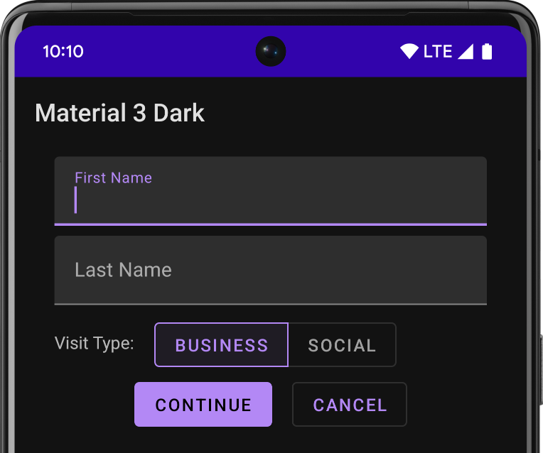
Figure 1. Dark material theme
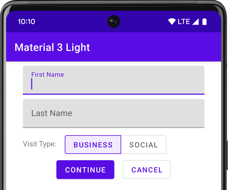
Figure 2. Light material theme
Note: The material theme is only available in Android 5.0 (API level 21) and above. The v7 Support Libraries provide themes with material design styles for some widgets and support for customizing the color palette. For more information, see Maintaining Compatibility.
注意:material themeは, Android5.0 (API level 21)以上で利用可能です. v7サポートライブラリは, いくつかのウィジェットのためのmaterial designのstyleを提供し, カラーパレットのカスタマイズをサポートます. 詳細は, Maintaining Compatibilityを参照.
Customize the Color Palette
To customize the theme’s base colors to fit your brand, define your custom colors using theme attributes when you inherit from the material theme:
ブランドに合うthemeのベースカラーにカスタマイズするためには, material themeを継承しtheme属性を使用してカスタムカラーを定義します.
<resources>
  <!-- inherit from the material theme -->
  <style name="AppTheme" parent="android:Theme.Material">
    <!-- Main theme colors -->
    <!--   your app branding color for the app bar -->
    <item name="android:colorPrimary">@color/primary</item>
    <!--   darker variant for the status bar and contextual app bars -->
    <item name="android:colorPrimaryDark">@color/primary_dark</item>
    <!--   theme UI controls like checkboxes and text fields -->
    <item name="android:colorAccent">@color/accent</item>
  </style>
</resources>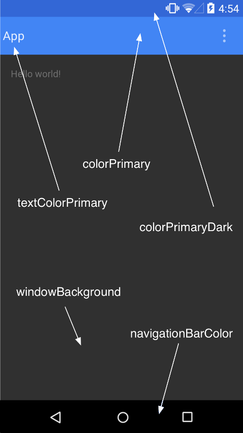
Figure 3. Customizing the material theme.
Customize the Status Bar
The material theme lets you easily customize the status bar, so you can specify a color that fits your brand and provides enough contrast to show the white status icons. To set a custom color for the status bar, use the android:statusBarColor attribute when you extend the material theme. By default, android:statusBarColor inherits the value of android:colorPrimaryDark.
material themeを使用すると, あなたのブランドに合ったステータスバー色にカスタマイズできます. ステータスバーの色は白色のステータスアイコンが見える範囲で指定します. ステータスバーにカスタムカラーを設定するには, material themeを拡張して, android:statusBarColor属性を使用します. デフォルトでandroid:statusBarColorはandroid:colorPrimaryDarkの値を継承します.
You can also draw behind the status bar yourself. For example, if you want to show the status bar transparently over a photo, with a subtle dark gradient to ensure the white status icons are visible. To do so, set the android:statusBarColor attribute to @android:color/transparent and adjust the window flags as required. You can also use the Window.setStatusBarColor() method for animations or fading.
また, ステータスバーの背後に描画することもできます. 例えば, 写真の上に透明なステータスバーを表示したい場合, わずかに濃いグラデーションを敷いて白のステータスアイコンが見えるようにします. そのためには, android:statusBarColor属性に@android:color/transparentを設定し, 必要に応じてwindow flagを調整します. また, アニメーションやフェージングのためにWindow.setStatusBarColor()メソッドを使用できます.
Note: The status bar should almost always have a clear delineation from the primary toolbar, except for cases where you show edge-to-edge rich imagery or media content behind these bars and when you use a gradient to ensure that the icons are still visible.
注意:ステータスバーにコンテンツを表示したり, 全画面表示のケースを除き, ステータスバーはプライマリツールバーと明確に分けられるべきです.
When you customize the navigation and status bars, either make them both transparent or modify only the status bar. The navigation bar should remain black in all other cases.
ナビゲーションバーやステータスバーをカスタマイズする際, それら両方を透明にするかステータスバーのみを変更します. その他の全てのケースにおいてはナビゲーションバーは黒のままとすべきです.
Theme Individual Views
Elements in XML layout definitions can specify the android:theme attribute, which references a theme resource. This attribute modifies the theme for the element and any child elements, which is useful for altering theme color palettes in a specific portion of an interface.
XMLレイアウトで定義する要素には, android:theme属性でthemeリソースを指定できます. この属性は, 要素や子要素のテーマも変えるため, 特定部分のテーマカラーパレットを変更するのに便利です.
LICENSE
Portions of this page are modifications based on work created and shared by the Android Open Source Project and used according to terms described in the Creative Commons 2.5 Attribution License.Original source: http://developer.android.com/training/material/theme.html